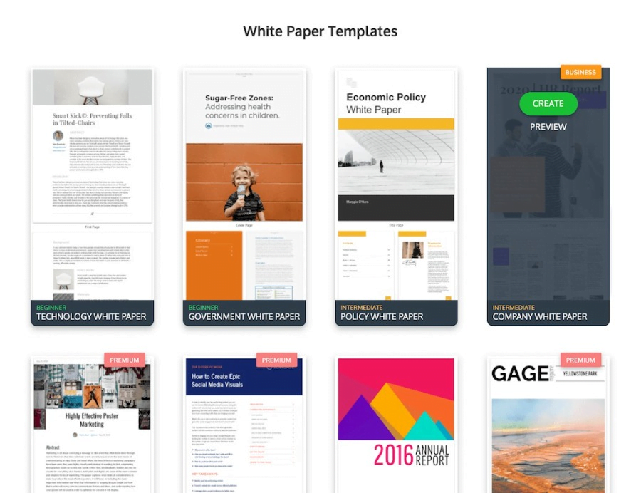
A well-formatted white paper can be a great source of information and inspiration, but it’s not always easy to create one from scratch. If you’re looking for tips on how to format your next white paper, Venngage has some suggestions that might help.
1. Be consistent with your white paper design.
Consistency is key – both in formatting and in content – when writing a white paper. Your goal should be to make the finished product as clear and easy to follow as possible, so it needs to be structured similarly throughout.
An excellent way to do this is by choosing an appropriate template or style guide, which will ensure all of your pages are uniform while still allowing room for customization based on their different functions. Of course, once you’ve chosen a style guide, you’ll want to make sure that all of your text and visuals adhere to it.
You can try the ready-made whitepaper templates of Venngage to see for yourself the difference consistency makes.
2. Select fonts based on the white paper size.
When choosing fonts for a white paper, be sure that they’re clear, clean, and easy to read. Doing this is especially important in areas where diagrams, illustrations, or graphs are used. These should have enough space around them so that their messages aren’t lost simply due to illegibility.
Venngage recommends sticking with a sans serif typeface, such as Helvetica or Arial, which will keep things simple while still looking professional. Venngage also suggests avoiding cursive fonts whenever possible; this will help prevent any unintended implications of formality.

3. Keep your technical white paper short and sweet.
While Venngage hasn’t done any research on white papers specifically, they can offer some helpful reports based on their studies of infographics. They’ve found that the ideal length for an infographic is 6 to 8 pages, with longer ones having diminishing returns.
For white papers, Venngage recommends small chunks of information that are easy to digest (no more than two or three pages each) instead of one long, drawn-out document. The templates in Venngage are specifically designed to help keep your white paper as concise as possible.

4. Make sure your visuals are clear.
White papers typically have a lot in common with other types of content marketing in terms of visuals, so Venngage’s best advice here is to follow all the general rules you should be following in your other efforts.
That said, Venngage has a few specifics to add as well. In general, opt for quality over quantity – that is to say, it’s better to have fewer high-quality visuals than numerous low-quality graphics. Venngage also suggests using large areas of color and white space (like those in Venngage’s infographics ) whenever possible.

5. A business white paper needs a strong Call-to-Action.
When writing your call-to-action, be sure not to muddle the message with jargon or technical terms; instead, make sure you’re speaking directly to your target audience. Venngage points out that this can often be done through the inclusion of an “enticing statistic” like this one: “Your average customer spends $250,000.”
Using numbers in your call-to-action is a great way to grab attention and engage readers. Venngage also suggests that you use language like “Find out,” or “Discover,” which gives the reader the impression that they’re gaining valuable information.
6. Have a memorable tagline.
A strong tagline can help create interest in your whitepaper; Venngage recommends using language like “A resource for” or “How to prevent.” You don’t want it to take away from what’s written in the main body of the text, but it should serve as an introduction and enticement. Venngage notes that if you’re interested in making your tagline stand out, try turning it into a question instead.
7. Effective white paper marketing involves top-notch visuals.
Just as Venngage pointed out above, your visuals should be easy-to-read while also employing ample white space and color whenever possible. They also add that you’ll want to avoid using too many very small graphics that pack a lot of information into a relatively small area.
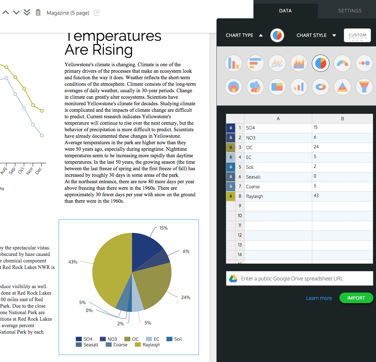
Venngage suggests reserving these for places where they’re being used in conjunction with text, rather than instead of it. Venngage also points out that combining data visualizations and infographics can create the best results because it gives readers a way to take in important information without having to work through pages of dense bullet points or long paragraphs.

8. Consider putting a photo on the cover.
If you’re going to include a photo on the cover of your white paper, Venngage recommends that it be related in some way to what’s described inside. Venngage also suggests that you use a photo that is up-to-date and relevant, as opposed to one that features dated or irrelevant information.
Venngage points out that this can often give readers a feeling of connection with the material – plus, it helps them see how much time, effort, and research went into creating your document. Venngage recommends being careful not to have any photos of people – these might inadvertently imply certain things about your company’s personality, which could turn off potential customers.
Venngage urges caution in the use of photos or other visuals that you wouldn’t want to be included in a news article. Venngage suggests that if you have your image-processing software, go ahead and add some branding to images before uploading them to Venngage.
Venngage points out that this is a great way to add more value to your white paper, while also making it feel like your own instead of simply using Venngage’s stock files. Venngage recommends against using company logos (unless they’re visually interesting) or anything that feels too corporate.
These are just some of the things that Venngage can suggest so you can come up with better graphics. Want more tips on creating effective white papers? Check out Venngage’s and start yours now!


